
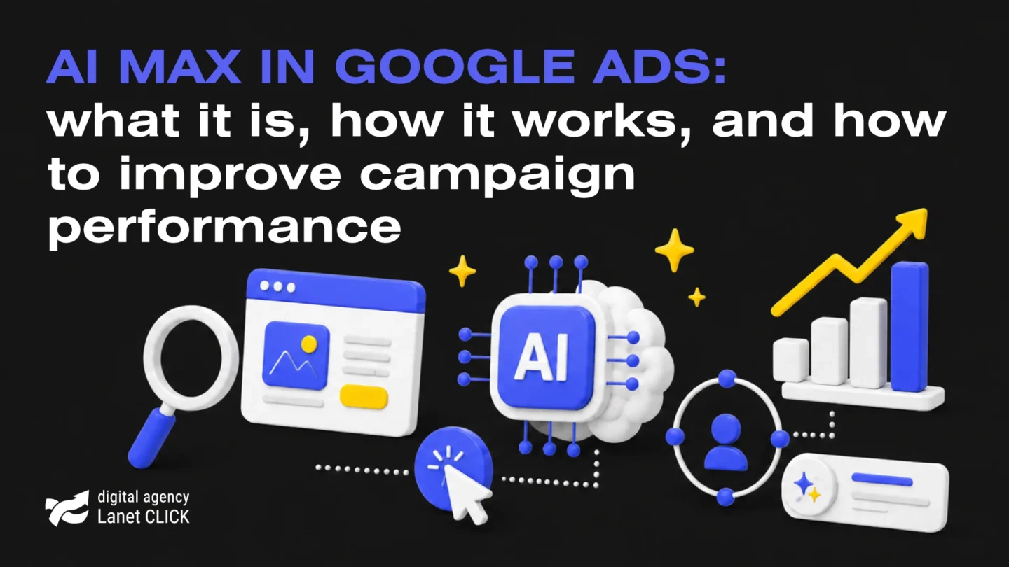
AI Max in Google Ads: what it is, how it works, and how to improve campaign performance
What if an advertising campaign could find new customers on its own, create more relevant ads, and optimize its performance? […]


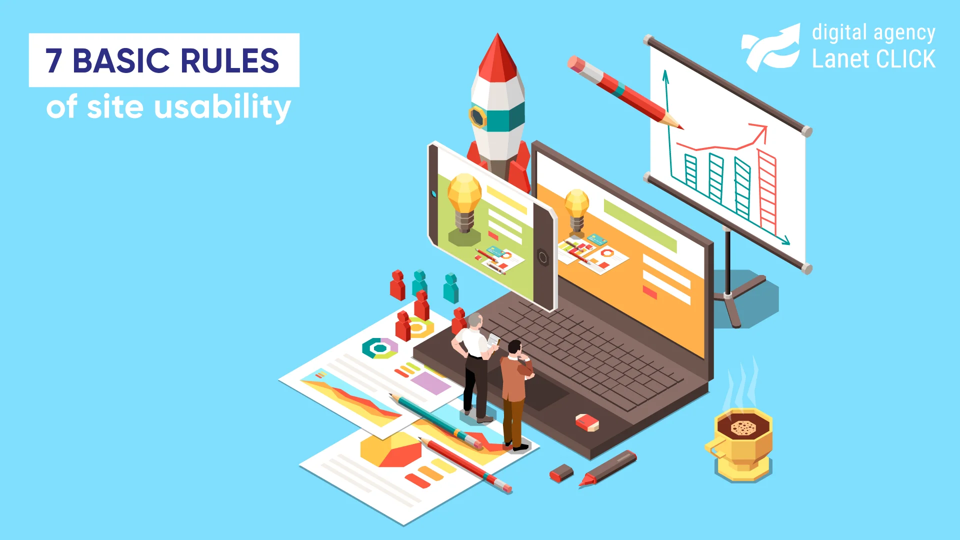
Usability is an indicator of the convenience of a web resource for users. It is one of the main features of the site. Usability is not just about ease of use. This concept includes the personal goals of the user, his feelings and emotions that arise when interacting with the site, as well as his satisfaction.
There are a number of conditions faced by the site when users close it without hesitation:
At the same time, the main goal of usability is to understand at the software development stage whether the clients for whom the site is created will be able to deal with it on their own and how quickly they will do it. A convenient web product allows you to significantly increase the number of visitors who will become users of the site, both temporarily and on a long-term basis. Users always get great pleasure from interacting with properly configured and organized site content. At the same time, the more users on the site, the more conversions.
It often happens that web designers engaged in prototyping a future site cannot objectively assess the future usability of the web resource because for them, everything seems clear. It is important to involve a UI/UX designer in the development of the site, who will audit the usability of the site (in particular, a heat map will be created, and the bounce rate studied) and identify the most popular errors in design, content, and structure of the site. These may include the following error options:

Experts identify a number of indicators that allow you to assess the usability of the site. These quality criteria will give an understanding of what should be on the site and what is best to avoid.
The user should always know what is happening on the site, as well as receive feedback. For example, after a user clicks on an item to buy, a special mark appears next to the cart icon.
The user may click some system functions incorrectly. Therefore, there must be a clear and visible emergency exit on the web resource. For example, when making a purchase, the user hurriedly clicked the wrong thing. Therefore, the site should provide the opportunity to go back one step so that the user does not fill out the form again.
Accelerators can speed up the interaction of the site for experienced users. At the same time, such a system should be simple and convenient for beginners. The web portal should be able to allow users to customize certain functionality. For example, the site should have search filters so that the user can quickly find what they need.
The site interface should not contain information that the user does not need or that may be needed in some cases. Each excess element is a distraction. For example, when registering on the site, you do not need to ask the user to fill in extra fields such as patronymic or fax.
Web portal users should not be confused. Functionally identical interface elements must look the same and have the same meaning.
Error messages should be made as clear as possible to the user. For example, a user on a site may come across a page that does not exist. Then it is important that the site offers users Back or Go to the main page.
Ideally, the site should be clear and without documentation. However, it happens that the user still needs help. The site should have a section Help or Questions and answers.


What if an advertising campaign could find new customers on its own, create more relevant ads, and optimize its performance? […]
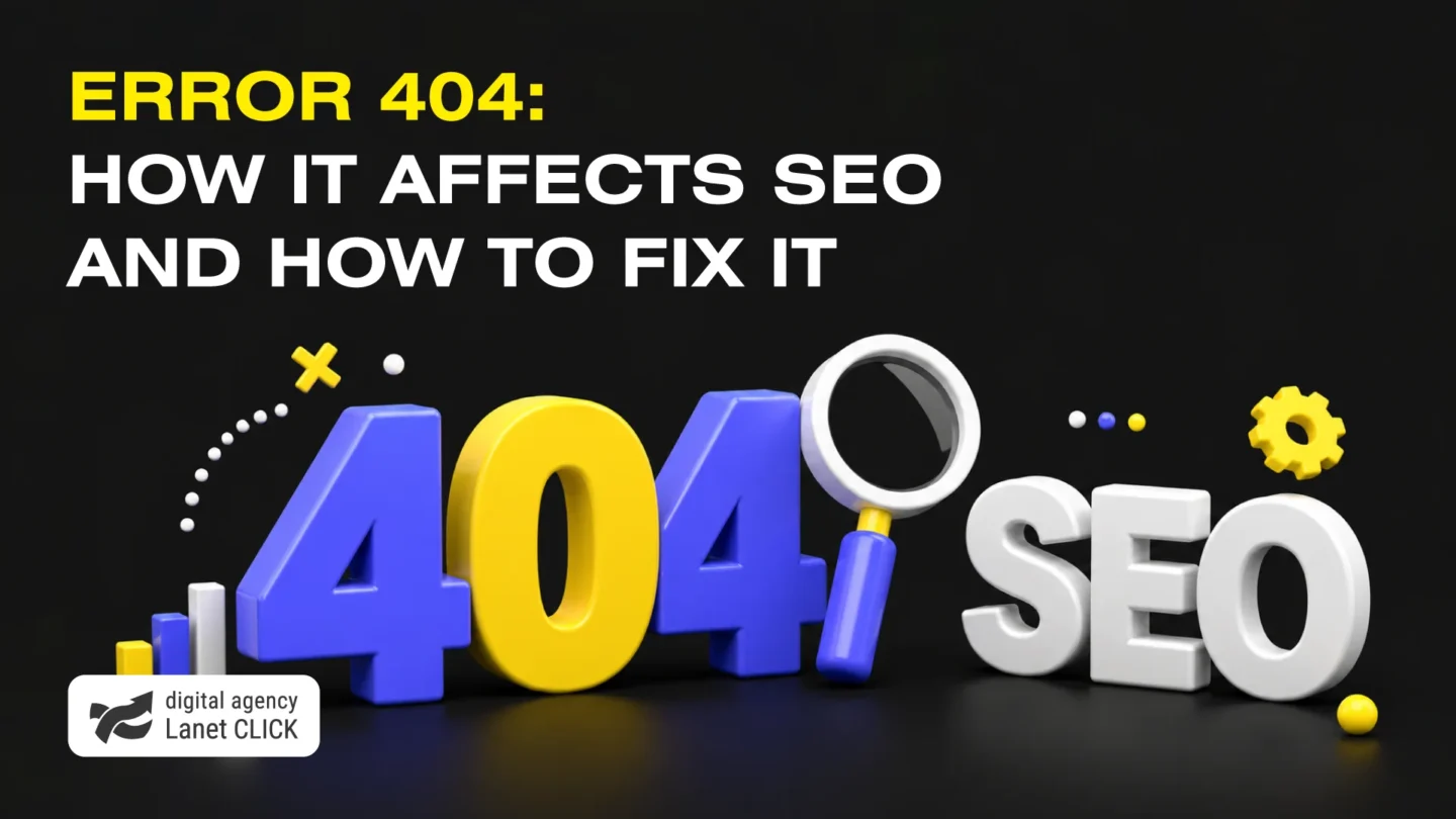
Clicked a link but saw a 404 Not Found message instead of the page you expected? This is one of […]
Every day, businesses spend thousands of hryvnias on advertising, but a significant share of campaigns fails to deliver the expected […]
A good strategy, perfectly selected digital tools, and their effective application will allow the business to increase profits, grow the customer base, and form recognition and loyalty. Do you want something like that? Contact us.
You have taken the first step towards effective online marketing. Our managers will contact you and consult you soon.