
AI Max in Google Ads: what it is, how it works, and how to improve campaign performance
What if an advertising campaign could find new customers on its own, create more relevant ads, and optimize its performance? […]


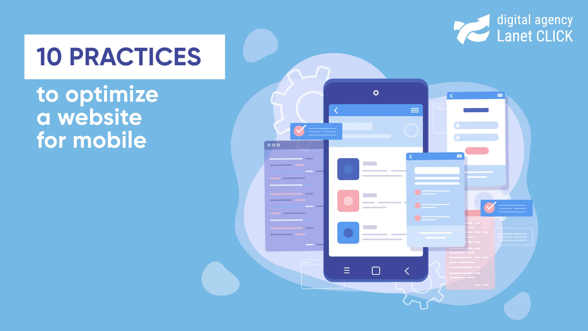
When promoting a site, SEO specialists advise against ignoring mobile optimization. What it is, why the mobile version is so important, and what methods exist for optimizing a web resource for a smartphone – read in the material.
A significant number of users access the global network from smartphones. According to various estimates, the number of those who prefer the phone is from 54% to 80% of the total site traffic. For most users, the smartphone is the device for easy and fast access to the global network. Along with this, mobile traffic only grows every year. Therefore, it is necessary to ensure that the site is adapted for mobile devices, that is, that the resource is convenient to use on a smartphone.
Mobile optimization is necessary for all sites. If a smartphone user, after visiting the site, sees that the web resource is not adapted for a smartphone (“flying” pictures, it is not convenient to press the keys, etc.), he will not hesitate to close it and open another link in the search engine.
Search engines also take this trend into account, so they introduce new ranking principles. Three years ago, the mobile index became a ranking priority for all new sites. Indexing with the priority of mobile content (mobile-first indexing) of pages depends mainly on their mobile version. The lack of adaptability to a smartphone affects the decrease in search engine performance. Therefore, full-fledged SEO does not take place without adapting the resource to a smartphone.

If you create a mobile version on a subdomain, when the user opens the site from a mobile device, the server will automatically redirect to this subdomain. In other words, different HTML will be sent to PCs and mobile devices, and URLs will be generated for each page.
The advantage of this method is fast loading. Disadvantages include changing the URL, the need to configure the relationship between versions, and laboriousness during implementation.
You can also create a mobile version on another template. Then the URL remains the same no matter what device the user is using. Only the HTML code changes. When the user gets to the website, the server determines the type of device from which the login was made and sends the corresponding version of the page.
An important advantage of this optimization method is the static URL. It, in turn, eliminates the need to work on optimizing versions for SEO. At the same time, the following disadvantages can be identified:
For an adaptive mobile version, it is not necessary to optimize either the desktop or the mobile version of the site. Regardless of which device the user uses, requests go to the same server, which sends the same HTML code to the user. The content of the resource adjusts to the screen resolution using CSS. It allows you to make the functionality and design of the resource for any device.
The advantages of adaptive mobile layout are a single URL for all versions of the site, the absence of unnecessary elements on the page, as well as the correct display of pages on all devices. At the same time, adaptive layout has a number of disadvantages. In particular, it is about the need to shorten texts when optimizing a site for mobile devices. In addition, if the site contains a lot of videos, large-format images or animations, it can affect the speed of page loading.
Dynamic serving is considered a more complex variant of adaptive layout. The peculiarity of this method is that the correct version of the page is issued by the server through the Vary HTTP request. Along with this, not only CSS changes but also HTML.
The advantages of this method are fast loading and the ability to display different content for the desktop (desktop version) and the mobile version. However, this method is time-consuming, and you cannot set it up without special knowledge. Also, dynamic serving does not work correctly on all devices. On models with non-standard diagonals, the design may be displayed with errors.


Optimizing a site for mobile devices can happen in different ways. One of them is the introduction of AMP. Thanks to such a framework, the site will be displayed in Google’s search results higher than others. Additionally, you can create an AMP content carousel on your site page. With the help of AMP, a duplicated level of content that is optimized for mobile devices appears.
Optimizing the site for the phone can also be done using Schema.org markup in mobile search. A special feature of Schema.org is that it helps answer a specific question of the user already in the search results. At the same time, it helps some site owners not spend money on PPC advertising. If your site is on WordPress and you want to implement Schema.org markup, you can install the Schema App Structured Data plugin.
When the popularity of the Internet was gaining momentum, Adobe Flash technology was very common. However, at the same time, this technology made sites bulky. More minimalist resources began to attract more users. Moreover, Adobe Flash makes sites inconvenient for mobile rendering. Because of this, it is worth removing Flash.
It is also worth taking care of optimizing the images on the site for mobile users. For the mobile version, image optimization is a critical component. In particular, it affects both the loading speed and the correctness of the page display. Google has given some tips about images to adapt to mobile devices:
In order for the mobile layout to be displayed correctly, you also need to take care of the video:
During an SEO audit, you need to check your site on different operating systems and devices. It will help you understand the compatibility of your site with as many displays and platforms as possible. You can use a number of programs for such a check. Including:
One of the ways to make the site mobile-friendly is to configure the CMS for the mobile version. CMS is a platform with a simple interface that, like a designer, contains the necessary tools that greatly simplify the work of creating and filling a site. At the same time, WordPress is considered the most popular CMS in the world. Its WPtouch plugin for creating a mobile version is easy to set up and suitable even for beginners.
To make your site mobile-friendly, take care of the resource’s loading speed. Slow loading pages lead to high bounce rates. To optimize the mobile version of the site, you need to reduce the number of plugins and the amount of code to a minimum for smartphones. For this, you can use the minifycode.com program.
Pop-ups take up a lot of space on mobile devices. Often, such windows can only annoy the user because they are too intrusive. Therefore, it is better to remove pop-ups and instead consider another ad format (such as hyperlinks to generate income from affiliate programs).
Tablets are a separate type of device. They have a larger screen than smartphones. If your content isn’t intended for them, it will appear roughly the same as it would on a regular computer. Therefore, it is necessary not to ignore users of these devices and to adjust the site for tablets as well.

Adaptation of the site to mobile devices plays a significant role in SEO because most searches are performed on smartphones. Search engines use the mobile index when crawling sites. Therefore, you should make sure that Googlebot can crawl the pages of your site.
Adapting a website for a smartphone is not an easy process. If you do not want to understand all the nuances, contact the specialists of the Lanet CLICK agency. In addition to mobile adaptation, specialists can conduct a site usability audit, promote the site on WordPress, launch ASO promotion, etc. The full list of services provided by our digital agency can be found on the website.


What if an advertising campaign could find new customers on its own, create more relevant ads, and optimize its performance? […]

Clicked a link but saw a 404 Not Found message instead of the page you expected? This is one of […]
Every day, businesses spend thousands of hryvnias on advertising, but a significant share of campaigns fails to deliver the expected […]
A good strategy, perfectly selected digital tools, and their effective application will allow the business to increase profits, grow the customer base, and form recognition and loyalty. Do you want something like that? Contact us.
You have taken the first step towards effective online marketing. Our managers will contact you and consult you soon.