
Partial redesign for a manufacturer of translucent structures
How to modernize the appearance of a website with non-global changes in the elements of the visual concept

Input data
Client: leader in the production of translucent structures in Ukraine.
Timing: 1 month.
Team: project manager, WEB-dev Team Lead, UI/UX designer, developer.
Problem: outdated site design, where the chaotic structure and lack of hierarchy scattered users’ attention. The lack of CTA elements and motivational blocks reduced conversion, and incorrect adaptability and localization errors worsened the UX. The visual component also needed correction: heavy gradients, outdated icons, and lack of hovers.

Tasks

transition from outdated aesthetics to a modern minimalist style that emphasizes the technological feasibility of production;
creating a clear content hierarchy: restructuring information blocks on the main page to consistently immerse the user in the sales funnel;
fixing the mobile interface with an emphasis on menu accessibility and ease of navigation;
implementing effective CTA mechanics, placing contrasting target action buttons with interactive hovers to increase interface responsiveness;
developing a pop-up thank you after submitting forms that consolidates a positive customer experience;
technical correction and localization: correcting language version errors and cleaning the code from heavy graphic elements (shadows, gradients) to speed up the site.
List of works
Results
Home page BEFORE-AFTER
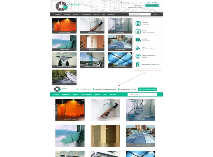
Block structure on the home page BEFORE
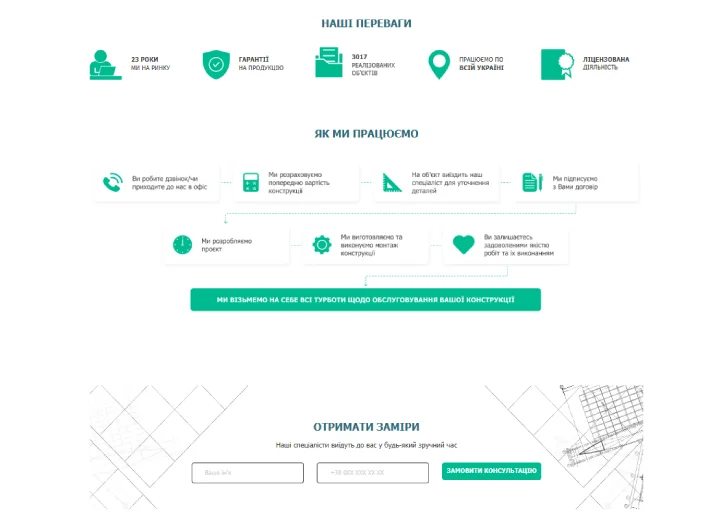
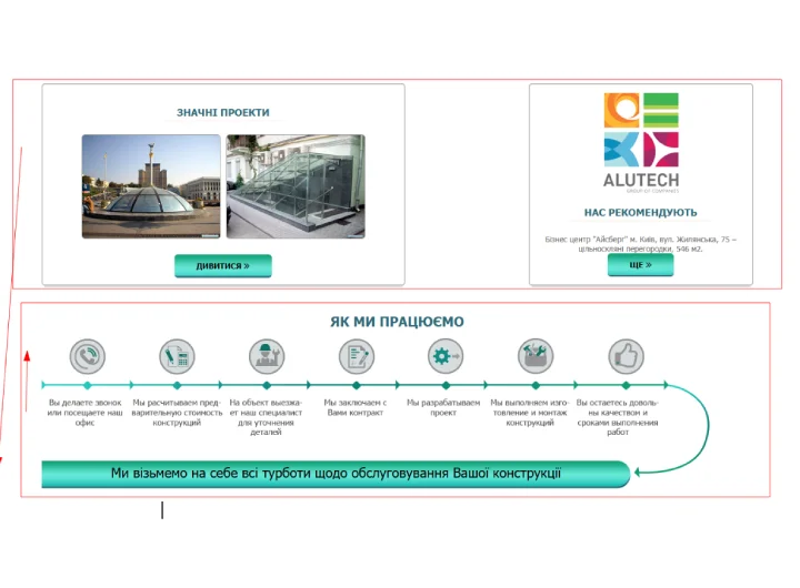
Block structure on the home page AFTER
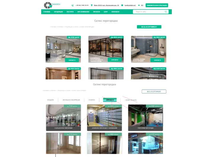
Service page BEFORE-AFTER
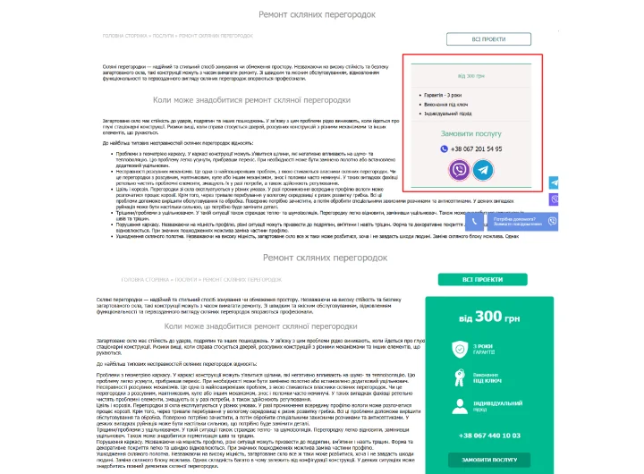
Block design on the service page BEFORE-AFTER
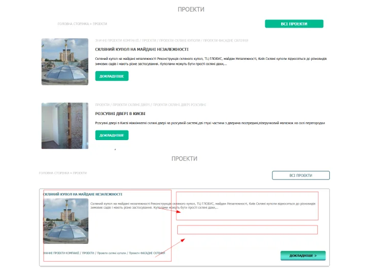
Cases page BEFORE-AFTER
Results
Home page BEFORE-AFTER
Block structure on the home page BEFORE
Block structure on the home page AFTER
Service page BEFORE-AFTER
Block design on the service page BEFORE-AFTER
Cases page BEFORE-AFTER
Conclusions
Do you want the same?


